Today’s interviewee is Ryan Johnson of Control Suite fame.
Ryan just launched PersonalGrid, a new file sharing and publishing web application, along with a complete overhaul of Control Suite, now renamed LivePipe UI.
Hi, Ryan. Could you please introduce yourself.
Ryan Johnson: I’ve been writing web pages since 1993, but I’ve only felt comfortable calling myself a programmer for the last 5 years. I drank the Prototype kool-aid about 2 and a half years ago, and I’d say today nearly 75% of all the code I write is JavaScript. I enjoy writing Ruby just as much, but fewer and fewer people are asking me to do any work in Ruby at all.
The language itself hasn’t evolved all that much, but watching our collective knowledge and understanding of it grow has been a surprise and delight.
You just released a new web application: PersonalGrid. Can you tell us about it?
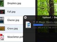
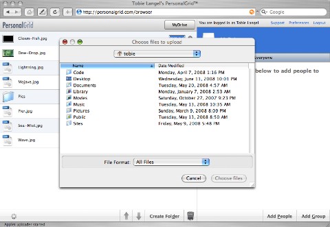
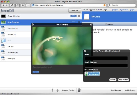
 RJ: PersonalGrid is a file-sharing and publishing application that I’ve written. You can use it to upload files and publish single files or whole folders with one click. It’s also easy to share with friends or whole groups of users.
We have a dev team of one (me), and this is our first beta release, so hopefully any bugs you encounter won’t be too catastrophic.
How are you using Prototype in PersonalGrid? And script.aculo.us?
RJ: On the Rails side, 95% of the actions use a REST interface and spit back JSON, so the app is very client-heavy. Almost all of the HTML is generated with the Prototype Template class, with a little usage of the new Element syntax thrown in where appropriate. I used the Draggables and Droppables from script.aculo.us, but little else. I also ended up making many modifications (which I will release on GitHub sometime soon) to both of those classes to support some extra functionality.
Both Object.Event and LivePipe UI are discussed below, but those libraries are integral to the application. So our JavaScript stack looks like Prototype → LivePipe UI → PersonalGrid Application. The actual PersonalGrid JavaScript code is a number of classes that represent the major UI components (File, Folder, Friend, Group, etc), and a number of controller classes that initiate Ajax requests and process the JSON responses.
In the process of building the application layer I kept seeing inklings of a JavaScript MVC framework, but I just don’t see where the reusability would come from. Prototype is ever more awesome, and I’m releasing components that others will hopefully find useful.
What were the biggest challenges you faced when building it?
RJ: Internet Explorer. The only debate about the IE debacle that should be going on is whether the product is a result of incompetence or was designed deliberately to sabotage the development of complex web applications. They got XHR and the mouseenter/mouseleave events right, but that is about it.
Any technical advice, tips, or tricks you'd like to share?
RJ: Start using a broadcast/subscription based event model for everything in your app, not just Element objects! Of course I am going to plug my own solution Object.Event — but whether or not you use that, having a system where you can trigger your own events that do not relate to the DOM is critical for the maintainability of your code base. The new custom events in Prototype 1.6 are great (and I used a few in PersonalGrid), but it’s still geared towards the DOM.
For example, we have a trash can feature in PersonalGrid. Each user’s root directory has a .Trash folder, which mostly acts like any other folder, but we need to specialize its behavior. The two biggest differences are that we want to take the .Trash folder out of the normal directory listing, and give it a special place in the UI. We also want .Trash to behave differently when you are in it. We have a Location class that is responsible for changing folders, rending the directory listing, etc. Instead of putting these specializations for the Trash inside the Location class, we have the Location class fire an onChangeLocation event, which the Trash class observes.
It’s not only a conceptually elegant way to solve the problem, but you get the added benefit of having all of the code that relates to the Trash in one place. As I was developing the app, we ended up wanting all of these little specializations for friendship folders, group folders, etc, so the broadcast/subscription model has really ended up paying huge dividends as the project progresses.
You're using a Java applet for file upload. Why did you choose to use that technology? What are the advantages over using flash?
RJ: There are some problems with the delay in loading the JVM, and the whole certificate/trust issues that all applets have, so I don’t want to sound too triumphant about the choice just yet. The main reason I choose Java instead of Flash is that you can drag and drop files onto the applet, which Flash does not support. Leopard supports dragging files directly onto file inputs, but users do not universally expect that behavior yet.
One of the areas I’d like to explore more is deep interaction between Java/Flash and JavaScript. The Java applet is one of the few parts of PersonalGrid that I didn’t write, but I worked closely with our Java coder to create a large series of JavaScript callbacks inside the applet so I could build a UI with Prototype.

There are a lot of fairly hairy undocumented bugs with LiveConnect (the Java/JS bridge), but until we get richer native functionality this is the only way to get around some of the security constrains browsers place on accessing the local machine.
You're well known within the Prototype community for Control Suite. Can you tell us a bit more about it? Are you using any of it in PersonalGrid?
RJ: Well I’d like to apologize to the users of Control Suite for neglecting it for the past 8 months! PersonalGrid and some other obligations really destroyed my schedule. Control Suite has just received a major update, and is now called LivePipe UI and is compatible with Prototype 1.6. Most of the complex UI elements you see in PersonalGrid (windows, context menus, selection, etc) are available in the new LivePipe UI release.
LivePipe UI tries to provide a set of reusable core UI components that has a similar API design philosophy to Prototype. So far only components I have needed are part of the kit, but I am hoping that it grows with time. Now that it is on GitHub I’m hoping that it will be easier for users to contribute. The biggest news to existing users is that the Control.Modal class has been completely rewritten, and it is now a subclass of Control.Window. There are also proper Lightbox and Tooltip classes. The new class system in Prototype 1.6 made that far more elegant than it would have been before.
PersonalGrid has a distinct Mac feel. What made you aim for a desktop-like application?
RJ: Since an application of this nature is all about finding and organizing files and folders, why not recreate an interface people are already completely familiar with? We have a ways to go to catch up feature wise to Box.net, but when I first used their service I noticed they used some desktop metaphors (like drag and drop), but overall the application still felt too much like a website. Plenty of web services should feel like websites, but I don’t think file management apps should (except for Drop.io, which is wonderfully simple).

With regards to the Mac feel… besides borrowing some of the icons (still wondering if we will hear from Apple legal), there are a lot of very particular things that I like about the Finder. One of the hidden features of the PersonalGrid UI is that if you pick up an item and hover over any folder, breadcrumb, group or friendship, you will navigate to that location, and you will still be able to drop the item in any sub folder at the new location. The Finder does this, but I rarely use it because you can have multiple Finder windows open, or use the column view. In a two paned interface it’s the only way to elegantly get an item from A to C without moving it to B first.
Rich web development is still in its infancy, but Apple (and others) have had many complex UI problems elegantly solved for years on the desktop, so when I would run into a brick wall like the A-to-C problem, I would see how it was solved in the Finder, or even read the documentation in the Human Interface Guidelines.
It was also an amazingly fun challenge to deconstruct and recreate something as basic as the selection for the new Control.Selection library, which is also one of the core components of the PersonalGrid UI. When building something that complex yet fundamental one realizes all of the tweaks that coders and designers before you have thought obsessively about.
